

|
The most common mistakes in icon creation?
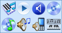
#1 Insufficient differentiation between images Sometimes within a single pack of icons, we have icons that look alike and it is really hard to tell what is what. If you donÒt see the signatures, you can very easily be confused by those icons. #2 Too many elements in one icon The simpler and more laconic the image is, the better. It is preferable to set the number of objects in one icon to a minimum. Nevertheless, MicrosoftÒs designers, inspired by the new icon format introduced in Windows Vista, decided to go big and drew over packed icons to justify their bloated budget. #3 Unnecessary objects An icon is an image that should be easy to understand. The fewer objects it holds, the better. It is great if the complete picture is relevant and not only part of it. Therefore, you have to think about the context of using icons. Take the database icons, for instance. The set may appear fine at a first glance, but if this application (or a separate toolbar) deals only with databases, we can (and should) remove the unnecessary part. #4 Non-unified style in a set of icons It is a similar style that turns several icons into a set. The uniting property can be any of the following: color scheme, layout, resolution, drawing style or several of those properties combined. If there are only a few icons in the set, the artist can keep some rules in his head. If the icon set contains over a hundred images and there is more the one designer working on this task (for instance, icons for a new OS), then special instructions are developed. Such instructions carefully describe how to draw an icon so that it fits straight into the rest of the pack. #5 Unnecessary details in small icons Progress does not stand still: GUIs have gotten the potential to display semi-transparent objects, lost the limitation on the number of colors and there is now a trend towards 3D icons. But is it actually all that helpful? Not necessarily! Especially if we are looking at icons sized 16?16 or smaller. #6 Misusing original symbols Selecting what is to be displayed in an icon is constantly a compromise between readability and uniqueness. Prior to a symbol (image) is created for an icon it is wise to consider how it is designed in other projects. Maybe the best solution is not in inventing something original but rather in adopting the existing solution. #7 National or cultural differences not being taken into account It is always necessary to consider the background in which your icon will be used. A key aspect here is national differences. Social customs, surroundings and gestures can vary dramatically from country to country. For example, a mail box would seam to be a perfect symbol for a ÓMailÔ icon. However, you can find all the different kinds of mailboxes in different countries. In that situation, you should either create an icon to resemble the mailbox that is typical for the userÒs country or state, or select a more universal illustration like an envelope. #8 Pictures of real interface elements in icons The manual on creating icons for Mac OS X tells us: ÓAvoid using Aqua interface elements in your icons; they could be confused with the actual interface.Ô But all in vain! We still have lost of icons that can be viewed as a few separate ones. #9 Text inside icons This fault is usually seen in application icons. Clearly the first thing that comes to mind when developing an application icon is to adapt the applicationÒs logo. What is wrong with the text embedded into the icon? Firstly, it is directly language-related and so impedes localization. Secondly, if the icon is done in a small size, it is impossible to read the text. Also, in the case of software icons, this text is repeated in the name of the application. #10 Outside the pixel framework As a rule, this problem occurs if you use a vector format for creating your icons. In large size everything looks pretty and clear; but in real life the icons are tiny, and under rasterization anti-aliasing blurs the objectsÒ edges.
|
| ArtIcons Pro can find, extract, edit and create Windows icons in color depths up to 16 million colors. Import and export icon images, create and handle icon libraries. It supports the new icon format introduced in Windows XP (8-bit transparency). Download it |
| Any to Icon allows you to convert multiple BMP, JPEG, GIF, PNG, WBMP and WMF images to Windows icons in one action. It also breaks down entire icon libraries into individual icons. You can change color resolution and size to create customized icons. Download it |
| Icon to Any allows you to convert Windows icons and cursors into BMP, JPG, PNG, GIF, ICO, CUR, WBMP and RC formats. It has a wizard interface. It's simple to process multiple files at once. You can find icons and make images for use on Web pages. Download it |
| ArtCursors allows you to edit Windows cursors in color depths up to 16 million colors. You also can search files and folders for cursors, import and export cursor images and create cursor libraries for better and more efficient storage. Download it |
| CustomIcons is an ultimate tool for customizing the icons on you desktop, in Windows Start menu and many other locations. Using CustomIcons you can easily replace default Windows icons with the ones to your choice. Download it |
| AhaView supports all popular graphic formats, including JPEG, GIF, PNG, BMP, ICO, CUR, ANI, WBMP. You can browse images in thumbnail mode, view pictures full screen with zooming features, convert images to JPEG and Windows Bitmap formats. Download it |
Icon Software | Graphic Software | Icons Downloads | Order Icons | Windows Icon Sets | Support
Privacy Policy | Terms of Use | Refund Policy
Privacy Policy | Terms of Use | Refund Policy
Copyright © 2000-2022 Aha-Soft. All rights reserved.
|
|